1. Transparent background
1, My backgrounds have often a central part with a pattern or texture.
If you don't want Blogger to do this part in a color, usually in white, follow the steps below.
2, Go to the 'Design'. Choose 'Advanced'. Click here.
You see where in the image above.
(You see my image in Swedish, but I believe you can see where to click anyway).
3, Choose Backgrounds from the list. Click here.
4, Here are three boxes
'Outer Background', 'Main Background', 'Title background'.
For each of these you can open a box with a color chart,
where you select the box 'transparent'. Do this for all three boxes.
Now you should have a design that allows you to see my background
without any other color that disturbs.
Some of Bloggers templates still makes one color in the middle section.
If it would be so for you, the solution may be to use a different Blogger template.
2. How to adjust the width of the blog....
Sometimes I receive questions about:
How to get the header to fit into the middle of the blog?
How to get the header to fit into the middle of the blog?
It's pretty simple.
But first make sure you have saved the header in the larges size,
you must click two times on the blog header before you save it.
Follow the images below, and I think you will understand .... ;)
But first make sure you have saved the header in the larges size,
you must click two times on the blog header before you save it.
Follow the images below, and I think you will understand .... ;)
Now you see Blogger in my Swedish version in the image above.
Even if you have a different language you see where you shall click.
1 Select 'Mall' (template)
2 Choose 'Anpassa' (customize)
Now select 'Justera bredder' (Adjust widths)
Here you need to test and try out the correct width.
(The width of the particular background you have chosen).
The width is probably somewhere between 980px and 1200px.
I hope I have been able to explain it in an easy way :)
3. Blog layout
Do you know that you only have a few seconds
In VintageMadeForYou,
you can find a lot of material in the blog's sidebar.
Click around and see what you like and want to use.
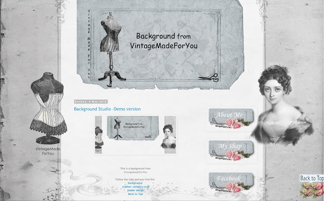
You see the example layout by clicking here.
There you also find links to the material you see in the images above.
before your visitors have decided
if they should continue looking into your blog or leave it?
Therefore it is important that the first impression is good and easy to understand.
As always it is good to have
a relevant content with images that fits what you are writing about,
but you can also do a lot with your blog's visual appeal.
Here are some great tips to keep in mind:
1. Choose a background that matches what you write about.
2. Select a text font that is easy to read,
and a letter size that is easy to read.
3. Large images is always a good idea,
and that all the photos in the blog have the same size.
It gives a balanced and professional impression.
4. Customize your blog's middle part,
so all the content is in the middle section of the blog.
Not outside on the part of the background where the designs / images / decor are. See here.
5. Make your blog center section transparent. See here.
Now over to the fun decoration of the blog.
You can decorate with:
1. A background with matching header.
2. Sidebar tags.
3. Footer image.
4. Some of my free images as decoration in your sidebar.
5. Back to top image.
In VintageMadeForYou,
you can find a lot of material in the blog's sidebar.
Click around and see what you like and want to use.
You see the example layout by clicking here.
There you also find links to the material you see in the images above.
4. How it can look like
Background Scrapbooking
Background Studio
How it could look like in your blog when you use one of VintageMadeForYou's backgrounds. I strongly recommend to use the header that belong to the background to get a professional look. Your blog becomes less cluttered and in that way also more appealing to visitors. A blog that is easy to read and overview is a blog that keeps a visitor longer.


