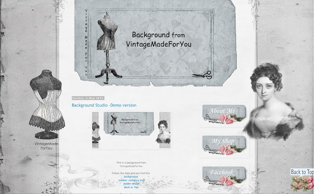
Do you know that you only have a few seconds
before your visitors have decided
if they should continue looking into your blog or leave it?
Therefore it is important that the first impression is good and easy to understand.
As always it is good to have
a relevant content with images that fits what you are writing about,
but you can also do a lot with your blog's visual appeal.
Here are some great tips to keep in mind:
1. Choose a background that matches what you write about.
2. Select a text font that is easy to read,
and a letter size that is easy to read.
3. Large images is always a good idea,
and that all the photos in the blog have the same size.
It gives a balanced and professional impression.
4. Customize your blog's middle part,
so all the content is in the middle section of the blog.
Not outside on the part of the background where the designs / images / decor are. See here.
5. Make your blog center section transparent. See here.
Now over to the fun decoration of the blog.
You can decorate with:
1. A background with matching header.
2. Sidebar tags.
3. Footer image.
4. Some of my free images as decoration in your sidebar.
5. Back to top image.
In VintageMadeForYou,
you can find a lot of material in the blog's sidebar.
Click around and see what you like and want to use.
You see the example layout by clicking here.
There you also find links to the material you see in the images above.


No comments:
Post a Comment